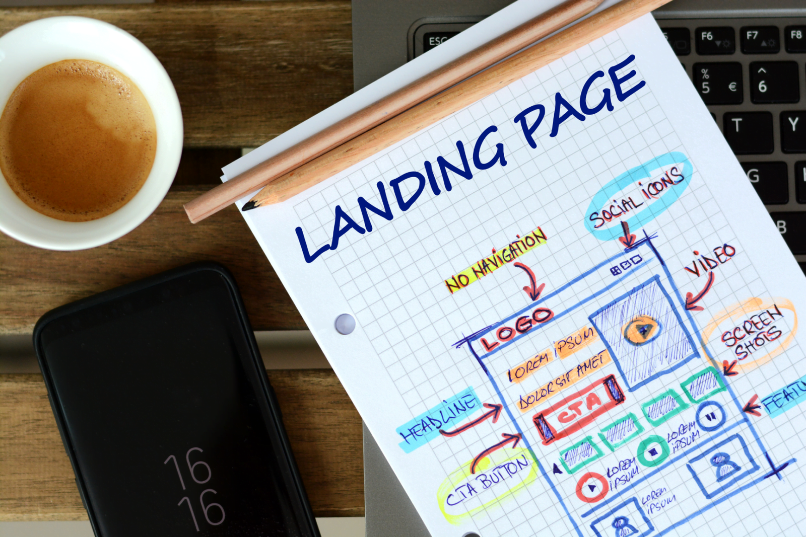
Landing pages play a crucial role in the success of your paid campaigns. A well-crafted landing page can significantly boost conversions and improve the overall performance of your marketing efforts. Let’s dive into the essentials of creating effective landing pages that drive results.
Real Questions and Worries
Before we get into the details, let’s address some common questions:
- “What makes a landing page effective?”
- “How do I design a landing page that converts?”
- “What elements should I include?”
These are all valid concerns, and by the end of this guide, you’ll have a clear understanding of how to create landing pages that work for your paid campaigns.
What is a Landing Page?
A landing page is a standalone web page designed specifically for a marketing or advertising campaign. It’s where visitors land after clicking on your ad. The primary goal of a landing page is to convert visitors into leads or customers by encouraging them to take a specific action, such as filling out a form, signing up for a newsletter, or making a purchase.
Keyword: landing page
Key Elements of an Effective Landing Page
1. Compelling Headline
Your headline is the first thing visitors see. It should be clear, concise, and convey the main benefit of your offer.
- Be Clear: Avoid vague or complex language.
- Be Relevant: Ensure it aligns with the ad that brought visitors to the page.
- Create Interest: Make it engaging and attention-grabbing.
2. Strong Subheadline
The subheadline should support the main headline and provide additional information or context.
- Expand on the Headline: Provide more details about your offer.
- Be Persuasive: Highlight the value and benefits.
3. High-Quality Images or Videos
Visuals can significantly impact a visitor’s perception and engagement.
- Use Relevant Images: Show your product or service in action.
- Include Videos: Demonstrations or testimonials can increase trust and understanding.
- Ensure Quality: Use high-resolution images and professional videos.
4. Clear and Persuasive Copy
Your copy should be concise, persuasive, and focused on the benefits.
- Highlight Benefits: Explain how your offer solves a problem or improves the visitor’s life.
- Use Bullet Points: Break down key points for easy reading.
- Be Specific: Avoid vague claims; provide concrete details.
5. Strong Call-to-Action (CTA)
The CTA is crucial for conversions. It should be clear, compelling, and easy to find.
- Be Direct: Use action-oriented language like “Buy Now,” “Get Started,” or “Sign Up.”
- Stand Out: Use contrasting colors and large buttons to make the CTA noticeable.
- Create Urgency: Encourage immediate action with phrases like “Limited Time Offer” or “Act Now.”
6. Trust Signals
Trust signals help build credibility and reduce visitor anxiety.
- Testimonials: Include quotes from satisfied customers.
- Reviews: Showcase positive reviews and ratings.
- Trust Badges: Display logos of recognized brands or certifications.
- Case Studies: Share success stories that demonstrate your product’s effectiveness.
7. Lead Capture Form
If your goal is to collect leads, include a form that’s easy to fill out.
- Keep It Simple: Only ask for essential information.
- Use Clear Labels: Ensure each field is clearly labeled.
- Incentivize: Offer something in return, like a free e-book or discount.
8. Mobile Optimization
Many users will access your landing page on mobile devices, so it’s essential to ensure it’s fully optimized for mobile viewing.
- Responsive Design: Ensure your page looks good on all screen sizes.
- Fast Load Times: Optimize images and minimize scripts for quick loading.
- Easy Navigation: Make buttons and links large enough to tap easily.
Designing Your Landing Page
1. Consistent Branding
Ensure your landing page aligns with your brand’s look and feel.
- Use Brand Colors: Maintain consistency with your brand’s color scheme.
- Include Your Logo: Reinforce brand recognition.
- Use Consistent Fonts: Stick to your brand’s typography.
2. Simplified Layout
A clean and uncluttered design helps visitors focus on the main message and CTA.
- Use White Space: Avoid overcrowding elements.
- Organize Content: Use sections and headings to guide visitors.
- Minimize Distractions: Remove unnecessary links or elements that can divert attention.
3. A/B Testing
Regular testing helps you identify what works best for your audience.
- Test Headlines: Experiment with different headlines to see which one performs better.
- Test CTAs: Try different CTA texts, colors, and placements.
- Test Layouts: Compare different layouts to find the most effective design.
Stories and Examples
The Online Course Example
Imagine you’re promoting an online course. Here’s how you might design your landing page:
- Headline: “Master Digital Marketing in 8 Weeks”
- Subheadline: “Join our comprehensive online course and boost your career.”
- Visuals: Include a video testimonial from a successful student and images of course materials.
- Copy: Highlight the benefits of the course, such as “Learn from industry experts,” “Flexible schedule,” and “Certificate upon completion.”
- CTA: “Enroll Now – Limited Spots Available”
- Trust Signals: Include testimonials, ratings, and logos of companies where your graduates work.
- Lead Capture Form: Simple form asking for name, email, and phone number in exchange for a free course preview.
The E-commerce Product Example
Or let’s say you’re promoting a new product in your online store:
- Headline: “Introducing the Ultimate Travel Backpack”
- Subheadline: “Durable, stylish, and packed with features.”
- Visuals: High-quality images of the backpack in different settings and a video demonstrating its features.
- Copy: Highlight key benefits like “Water-resistant,” “Multiple compartments,” and “Lifetime warranty.”
- CTA: “Shop Now – Free Shipping”
- Trust Signals: Display customer reviews, star ratings, and a satisfaction guarantee badge.
- Lead Capture Form: Pop-up form offering a 10% discount for signing up for the newsletter.
FAQs about Creating Effective Landing Pages
1. How long should my landing page be?
The length of your landing page depends on the complexity of your offer. For simple offers, keep it short and to the point. For more complex products or services, provide detailed information to address potential questions and concerns.
2. How do I know if my landing page is effective?
Track key metrics such as conversion rate, bounce rate, and average time on page. A/B testing different elements can also help you determine what works best.
3. Should I include navigation links on my landing page?
It’s generally best to minimize navigation links to keep visitors focused on the primary goal of the landing page. However, including a link to your home page or contact information can be useful for building trust.
4. How can I improve my landing page’s load time?
Optimize images, minimize the use of large files and scripts, use a reliable hosting service, and consider using a content delivery network (CDN) to speed up load times.
Wrapping It Up
Creating effective landing pages is essential for maximizing the success of your paid campaigns. By focusing on key elements such as compelling headlines, persuasive copy, strong CTAs, and trust signals, you can design landing pages that drive conversions.
Remember, the key to a successful landing page is continuous testing and optimization. Regularly review your performance metrics, experiment with different elements, and make data-driven adjustments to achieve the best results. Happy designing!

